Wednesday, 18 January 2017

Text portraits

Taking inspiration from Ralph Ueltzhoeffer text portraits I decided to create some of my own, but with a slight twist. Ueltzhoeffer's portraits mostly have a dark background and I've used a white one. By doing this it has allowed me to experiment and develop my pieces and come out with my own take on Ueltzhoeffer's creations. Using masks and playing with the opacity of layers has led to my final pieces below.


My pieces
.


The process

I started with an isolated image that I had converted to black and white.


I then used the magnetic lasso tool to draw around my model and create a mask.

Next, I added my text. I drew a text box the size of my image and filled it with the lyrics from my models favourite song. 

After moving the mask layer above the text layer to place it at the front I began to adjust the opacity of the mask layer. By reducing the opacity of this layer allowed the lyrics behind it to show through at a lighter rate.

Finally, I adjusted the opacity of the text layer just to reduce the boldness of the text.

Contact Sheets


Tuesday, 8 November 2016

Homeless - series 2

For my second series of Homeless, I chose a teenager as my subject.

I sketched out my ideas before hand to ensure they would work on a sign.


Contact sheets


Homeless - series 1

For my first forays into ‘emotional honesty’ inspired by Wearing, I wanted to take a series of almost identical images, where only the wording on the placard changed, and see if this influenced the way the subject was viewed.

For my first photograph series entitled Hungry and Homeless, I wanted to examine people’s attitudes to the homeless. To set up my shoot, I sourced a suitable location, appropriate clothing and props, and a willing model. On location, I set up the scene and briefed my model. I had assistance with the placard changeovers, as I needed my model to remain in position, and the camera was on a tripod to ensure stability and maintain the same photo position. 

I sketched out my placard ideas beforehand to ensure they would work on a sign.


The process


I used the MAGNETIC LASSO TOOL to trace the outline of the red cup.


I then went to SELECT and then to INVERSE. This means everything but the red cup is selected.


 I then went to IMAGE and ADJUSTMENTS and then to BLACK & WHITE. This converted everything other than the cup to black and white.


 I then decided that the white logo on the sock stood out to much. I used the CLONE STAMP TOOL to get rid of the logo.


 I used the rest of the black sock to get rid of the white logo.


I then added rulers to my image and noted down the dimensions so each photo would be cropped in exactly the same place.


Contact Sheets


Tuesday, 1 November 2016

Gillian Wearing inspired mini series

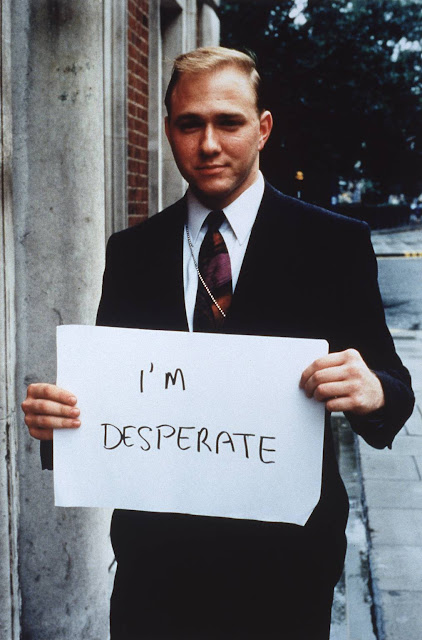
Gillian Wearing is the artist who has inspired me to create this mini series. Gillian has always created photographs and films which explored the public and private lives of ordinary people. This is shown in her famous 1992-1993 series, “Signs that say what you want them to say and not signs that say what someone else wants you to say”. She asks people to write down what's on their mind.
“What might make it uncomfortable is people being so honest. Especially within the art world, you can get very guarded. That’s why I ask strangers, because people are much more honest to someone they’re not going to see again.” 
One of her best know images from this series is the image titled I'm desperate.

This image consist of a smartly dressed man in a suit with a content expression, holding a sign saying 'I'm desperate'.


''People are still surprised that someone in a suit could actually admit to anything, especially in the early 1990s, just after the crash… I think he was actually shocked by what he had written, which suggests it must have been true. Then he got a bit angry, handed back the piece of paper, and stormed off.''
I plan to emulate Wearing's work using card statements in two different ways: firstly by using pre-written statements to manipulate the interpretation of images; and, secondly, to get people to reflect on their outward impression to the world.

Saturday, 1 October 2016

Artist contact request

I wrote to three artists, asking them questions about their work, including their influences, how they go about creating their images and if they had any tips on going about emulating their image. 

Firstly, I sent an email to Matt Siber.
I also sent an email to Jeffrey Wolin.


Finally, I sent an email to Ralph Ueltzhoeffer.

Wednesday, 21 September 2016

Style Emulation - Matt Siber

Artist Matt Siber is interested in the ways in which we communicate as a culture within public space. He is challenging the powers of persuasion and influence exerted upon large groups of people through advertising, news media, branding and propaganda. His work ‘seeks to investigate the methods and underpinnings of these systems of communication in an effort to understand them better’.

I will be attempting to emulate one of Siber's images from his 'The Untitled Project'. In this project Matt explores issues of communication in public space. He does this by separating the text from the visual photograph.


I planned out my design first so I knew how to layout my embroidery design on the fabric.


This is my take on Matt Sibers work. 


This is the original design (below), which I photoshopped to remove the text from the visual design using the stamp tool.